Using design system strategy to increase UX maturity
Facilitating developer engagement through hands-on Figma training and fostering a more user-centred community approach
Strategy, Ui design, education
Volvo Cars
Designer & mentor

Motivation
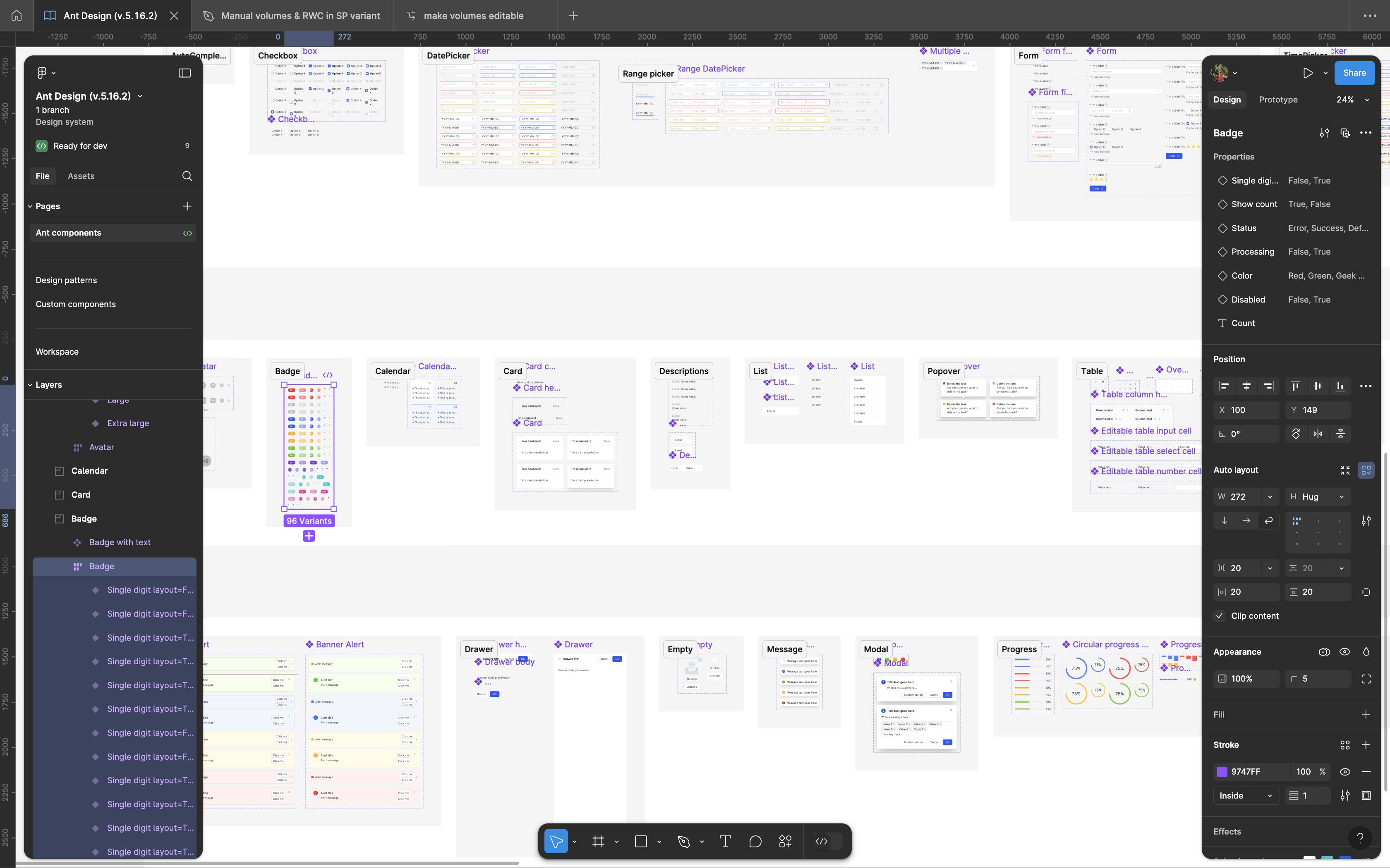
The Volvo Cars web design system was tailored to integrate the company's branding and values seamlessly into its primary e-commerce website. While this goal was successfully achieved, given that the majority of the software used by Volvo is also built by Volvo, it's equally important to evaluate how to build usable and enjoyable internal tools for an entirely different set of users.
The main point of contention is sizing. Business users demand more space for their data. This means that while large clickable areas on e-commerce buttons enhance accessibility for a broader range of users, in business software, the same horizontal padding (totaling 64 pixels in the case of Volvo Cars) can feel excessive and inefficient. Business software users often prioritize data density and quick access to information over the spacious, touch-friendly design required for consumer-facing websites.
Moreover, while the combination of pure white and pure black creates a strong, clean contrast that aligns with the brand's minimalistic visual identity, applying this high-contrast scheme in a business system may lead to eye strain over long periods.
 Example from the Volvo Cars design system
Moreover, while the combination of pure white and pure black creates a strong, clean contrast that aligns with the brand's minimalistic visual identity, applying this high-contrast scheme in a business system may lead to eye strain over extended periods of use.
These points, along with the risk that relying on a single centralised platform team to provide custom UI content for an entire organisation the size of Volvo may slow down business operations, highlight the need for locally managed solutions. At the same time, it also creates an opportunity to engage DevOps to prioritise usability in environments where UX maturity is usually low.
Approach
Building on the motivation to tailor our design system for business software and address the unique needs of our internal users, it became clear that empowering our developers and designers with the right tools and skills was essential. The challenge was not only to create a set of usable, high-quality UI components but also to foster a more user-centered mindset among development teams. To achieve this, I focused on leveraging Figma as an interactive platform to engage developers directly in the design process.
To begin, I trained junior designers to replicate components from an external library in Figma. This was done to develop a library of pixel-perfect prototyping components that would set a high standard, while simultaneously addressing any gaps in using the design tool.
By adding to the design patterns and providing clear guidelines on how to apply the components within our business systems, I established a reference point that helped developers work independently while following design best practices. This not only ensured consistency between design and implementation but also served as a learning tool for the team.

I then organised whiteboarding workshops with developers, focusing on how to apply UI components with usability in mind. The goal was to empower them to adapt these components for various use cases, rather than relying on a one-size-fits-all approach. By stepping away from the idea of using the same component everywhere just because it's available, we encouraged a more thoughtful application that prioritises usability. This collaborative approach helped developers become more engaged with the user experience, ultimately raising the overall standard of UI across the board.
Conclusion
Using Figma to engage developers and train them on how to use the external components had an immediate positive impact on our user experience. With the biggest improvements seen in navigation, data input accuracy, and readability. By providing clear design patterns and hands-on guidance, we helped developers understand how to create higher quality frontend UI that matches our design goals. This approach made our teams more user-focused and improved the consistency of our internal tools.
The long-term goal is to fully align the look and feel of the outsourced frontend library with our central design system. This will create a more cohesive and streamlined user experience across all platforms. While the collaborative tools and training were a great first step, they also set the stage for future improvements as we continue to refine and integrate our design system.